The hallway is often the last to be painted and one of the most overlooked spaces in interior design. The vital space connects various parts of your home and welcomes people in, so no surprise its colour scheme can significantly impact the overall ambience and feel of your home. The right colour can make your hallway feel welcoming, spacious, and harmonious with the rest of your house. Here's our list of choices and the pros and cons, when finding the perfect hue for your hallway.

Go Moody: Embrace Dark Colours
Dark colours in a hallway might seem like a daring choice, but they can create a dramatic and sophisticated atmosphere that transforms this often-overlooked space into a statement area. Deep shades like navy blue, charcoal grey, or forest green add a sense of intimacy, making your hallway feel cosy and inviting. Although there is one thing you can’t forget about – when paired with the right lighting and décor, dark colours can make a bold and elegant impact – so make sure to put some thought into it.
One key to successfully using dark colours is balance. Contrast the moody walls with lighter elements such as white trim or light-coloured artwork. Mirrors, in particular, are excellent for reflecting light around a space, making the space feel larger. Additionally, consider the finish of your paint; matte or eggshell finishes can give a soft, velvety texture, enhancing the richness of the colour, and making the moody tones altogether more sumptuous.
Another advantage of inky colours is their ability to conceal imperfections. Hallways are high-traffic areas, and darker hues are more forgiving of scuffs and marks, keeping your space looking fresh and sophisticated with less maintenance.
Go Bright: Infuse Energy and Light
Bright colours can transform your hallway into a vibrant, energetic space that lifts your spirits as soon as you walk through the door. Shades like sunny yellow, sky blue, or coral create a cheerful and welcoming atmosphere, making your hallway feel like a breath of fresh air. Jolly hues can make a narrow or dimly lit hallway appear more spacious creating a sense of openness.
When choosing a bright colour, think about the overall mood of the space. Warm tones like yellow and orange add warmth and energy, while cooler shades like turquoise or mint can conjure up a calming and refreshing feel. To avoid anything being too overwhelming, consider using bright colours on an accent wall or in combination with neutral tones.
Accessorising a brightly coloured hallway can be fun and creative. Use contrasting or complementary colours in your artwork, rugs, and furniture to create a harmonious and lively look. Light fixtures with playful designs can also enhance the cheerful atmosphere, making your hallway a true reflection of your personality and style.
Go Somewhere in the Middle: Balance with Mid-Tones
If you’re looking for a balance between the extremes of dark and bright, mid-tone colours are the perfect compromise. Shades like sage green, dusty blue, or soft terracotta are calm and serene without being too bold or ultra-neutral.
Mid-tone colours are versatile and can complement a wide range of décor styles and tastes. They pair well with both light and dark furniture, allowing you to experiment with different looks without committing to a single aesthetic. For a cohesive design, choose mid-tone colours that match the overall colour palette of your home, ensuring a smooth and seamless flow from one room to the next.
To enhance the appeal of mid-tone colours, consider adding texture and patterns through wallpaper, rugs, or wall hangings. Subtle patterns can add depth and dimension, while textured elements like wainscoting or beadboard can bring a touch of elegance and sophistication. With mid-tone colours, your hallway can become a beautifully balanced space that feels both comfortable and stylish.
Go Neutral: Sometimes You’re Dead-set on Something not too Noticeable…
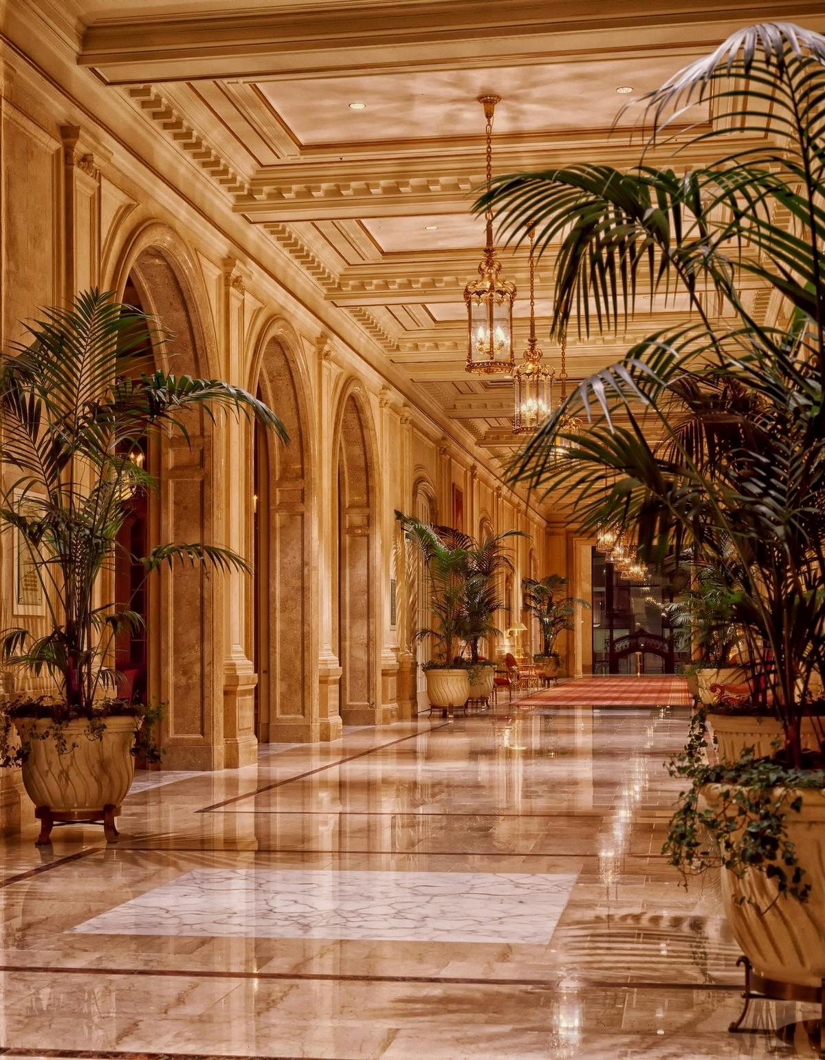
Neutrals are a classic choice for hallways, offering timeless elegance and versatility. Colours like beige, taupe, grey, and white create a clean, uncluttered look that can serve as a blank canvas for any style of décor. While some might consider neutrals safe or even dull, they can be anything but when used creatively.
The beauty of neutrals lies in their ability to juz other design elements. For instance, a crisp white hallway can make bold artwork or vibrant rugs stand out, acting as a perfect backdrop that allows your style to shine. Similarly, soft grey walls can add a touch of modern sophistication, especially when paired with sleek, minimalist furniture and metallic accents.
To keep a neutral hallway from feeling too stark or bland, focus on layering textures and materials. Think of incorporating natural elements like wooden furniture, woven baskets, or plush rugs to add warmth and depth. Subtle patterns, whether in wallpaper, textiles, or tiles, can also perk up a space, stopping it from feeling too one-dimensional.
In a dark hallway, lighting plays a crucial role in a neutral one. Use a combination of ambient, task, and accent lighting to create a well-lit, inviting space. Pendant lights, sconces, or even a statement chandelier can add a touch of elegance.
The colour you choose to paint your hallway can dramatically influence its look and feel. Whether you opt for moody dark tones, bright and lively hues, balanced mid-tones, or timeless neutrals, each choice offers unique possibilities for creating a welcoming and stylish entrance to your home. Consider your personal style, the natural light available, and the overall aesthetic of your abode to find the perfect colour that’ll make your hallway a beautiful and functional space.